A project should have an overall visual identity for its communications. An effective visual brand identity is achieved by the consistent use of particular visual elements to create distinction, such as the iHelp logo, specific fonts, color palette, and graphic elements. It will be incorporated in all promotional / dissemination material as well as document and presentation templates, produced during the project and will be used by all project partners in their communication activities.
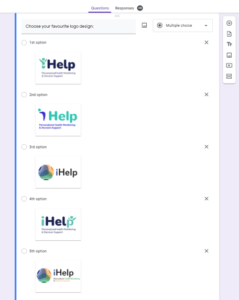
During the M1 of the project, together with some of the partners we brainstormed to create a logo that would reflect the identity of the iHELP project. Five designs were proposed and all partners participated in the final selection as you can see in the online selection process form
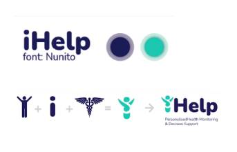
The partners favored the following logo with the following colors and concept as you can see on the following figure. We wanted to highlight the patient centricity and the Health elements of the project. Green and blue are a combination of health and technology colors and nunito was selected as the font family.
The color codes of the logo are presented below:
![]()
| Scheme | Blue | Green |
| RGB | 26;34;82 | 89;194;175 |
| HEX | #1A2252 | #59C2AF |