One of the goals of the iHelp project is to realize a platform that can provide final users with personalized prevention and intervention measures. In concrete, alerts are sent, that may consist, as an example, of suggestions for consultations, screening, therapy reminders, or messages, and dialogues. The latter is a new way to interact with the users, it is not only a message that reaches the individuals through their mobile phones but the possibility of a chat with a virtual coach.
All the prevention measures that are suggested to the users are based on a number of studies performed by experts from different domains: clinical, behavioral, and technical. This led, as one of the results, to a model that, by analyzing some data and applying some Artificial Intelligence, tries to understand which content should be delivered to the final user.
The questions were: how to estimate how good is this model? How to estimate if the model fits the purposes of the experts? How could the health care professional (HCP) understand if the mitigation plan, designed for the individual, is good enough for him/her or if some refinements are needed? How could the technicians understand if some fine-tuning of the underlying model is required?
The answer was: by analyzing the impact those contents have on the behavior of the recipients; this was the idea behind the conception of the Impact Evaluator in iHelp.
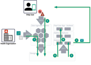
The image shows the init and feedback loop, based on the overall iHelp architecture, which is explained in a previous blog post.
- The Health Care Professional set the goals of the individual and configures the iHelp platform to ingest the primary data that the health organization already has.
- The specific component reads the data and triggers the sending of the right content.
- The content is delivered to the individual.
- The individual, using the mobile app on his/her phone, feeds the platform with the secondary data that will be stored inside the iHelp platform. Any other primary data which is produced by other external services of the health organization, like the lab tests, will be stored in the iHelp Platform as well (as in step 1).
- When the HCP requests the analysis, the Impact Evaluator read all the data needed to elaborate on the result.
- The result of the computation is shown to the HCP through his/her dedicated web application.
Please note that Steps 1 to 4 will be performed in a loop and Steps 5 and 6 will be performed on demand.
Ideally, the computation process will follow some sequential stages. First of all, the individuals, who had received some content in a specific time range, will be clustered by some characteristics – such as age, gender, and estimated risk defined in accordance with what was highlighted by the experts that had been working on the evolution of the model.
Every cluster will be again split in relation to the behavior subject of the content, and the type of message, e.g., merely informative, about prevention, or promotion.
Once those clusters are generated, the Impact Evaluator will retrieve the plan prescribed for each individual present in each cluster, and store it in the iHelp platform.
The subsequent stage consists of the retrieval of the delivered messages for each topic and each individual in the specified range of time.
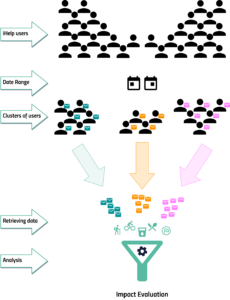
For the same temporal window, all the primary and secondary data, related to the topics and the goals present in the plan, will be gathered, by the Impact Evaluator, from the iHelp platform.
At this point, the Impact Evaluator will calculate for every individual how many days the planned goals were reached in the date range. It will also calculate the improvement or worsening for the specific topic for the whole cluster of users.
The final result of this process that we would like to show to the Health Care Professionals, Data Modellers, and Lifestyle coaches, is how and if the content sent to the individuals impacted their lifestyle.
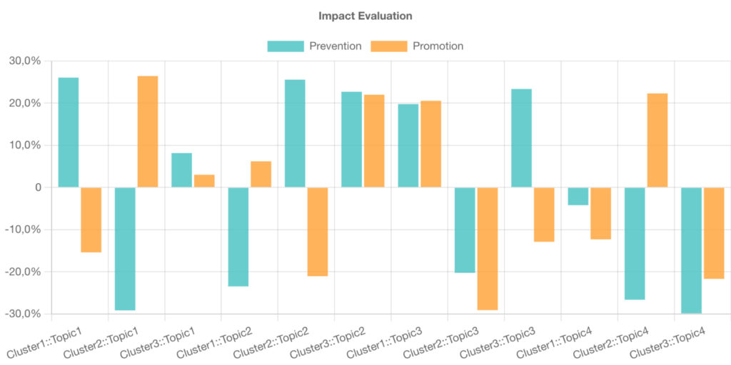
The figure below represents a possible chart to be included in the HCP’s dashboard. The chart shows the average progress, in percentage, of the number of goals reached for every cluster and every topic, both for the messages of Prevention and Promotion kind. For instance, in the example below, we can see that for Cluster 2 and Topic 2 the prevention content produced an improvement of 25% in reaching the goal, while the promotion content was counterproductive, because there is a worsening of 20% in achieving the goal. So this case suggests that the kind of content sent to the users should be better analyzed.